Designing with words

Designing with words

Designing with words

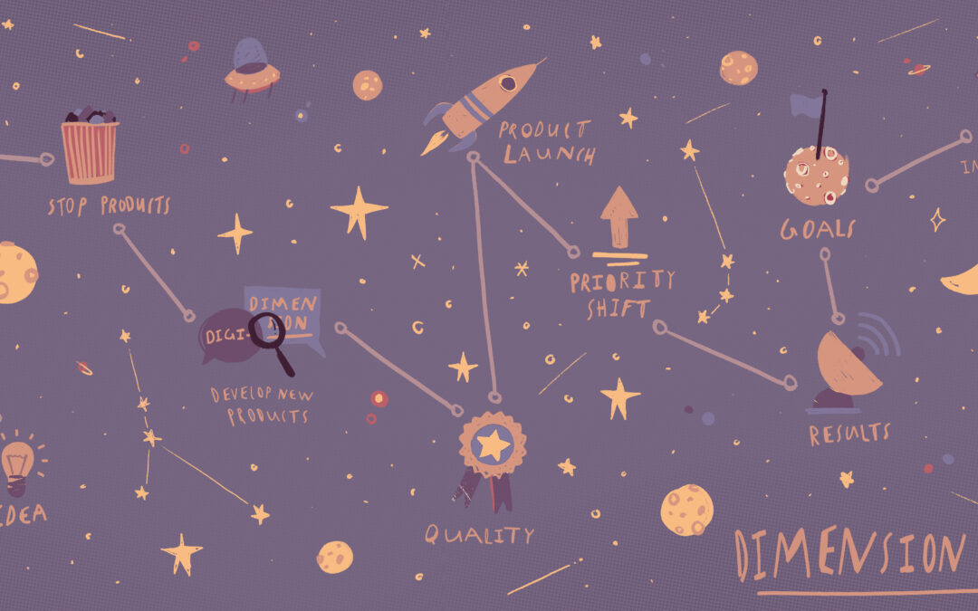
Kevin Hoegger created hand lettering-style illustrations to help us show how simply using words, letters and design could effectively get across a strategy.

He started by suggesting inspirations from which we could choose – in this case architecture – and built the visual from there.

Of all of the Forum case study sketches, participants related to these with the fewest questions. Maybe as business people, we easily “get” words and linear organization.

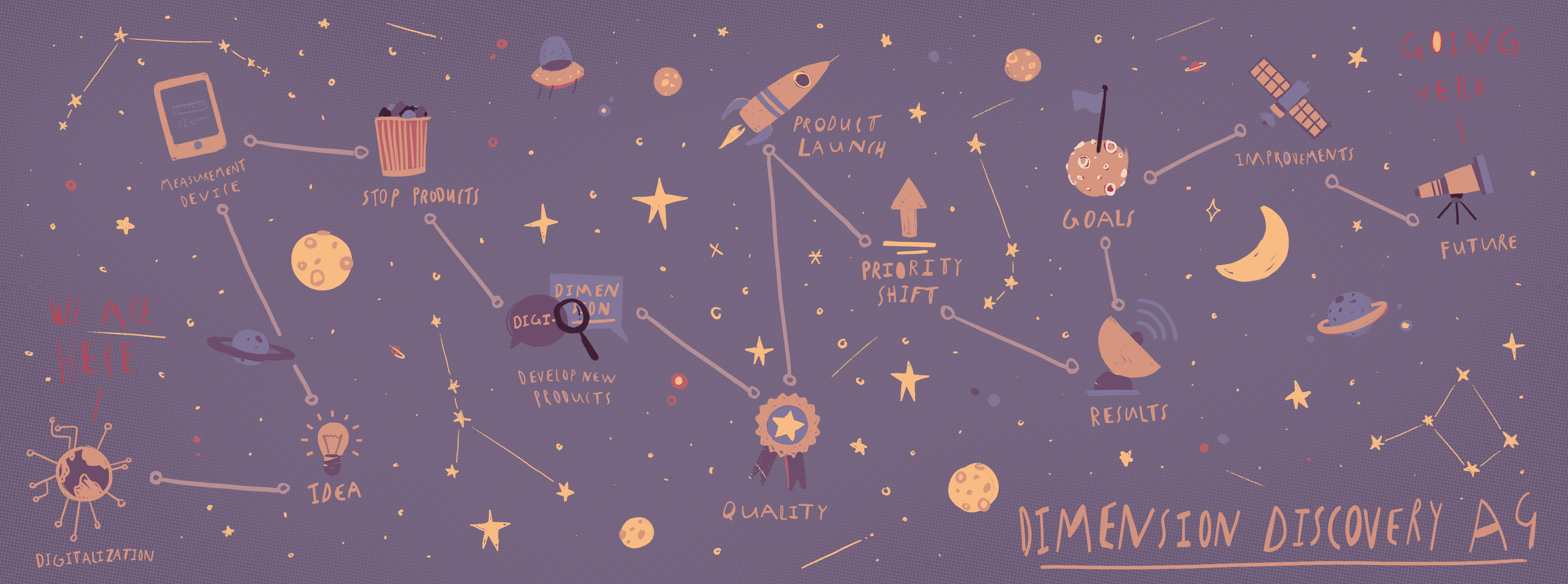
Kevin also brought examples of how to expand on the visual with hand-out template variations. Practical and pragmatic.

Here, his resulting “taster” put movement into the growth.

One word, designed. A visualized reminder of the full conversation.


About the artist

Kevin Hoegger, represented during the Forum through Visualeyes International, has worked globally with clients such as Nike and RedBull, especially for promotional designs and exhibits. His passion for typography ranges from three-dimensional concrete letters to ancient calligrapy and digitally-generated forms.

Do you have a Prezi?

Do you have a Prezi?

Do you have a Prezi?

Science sports reporter David Epstein does! He used it cleanly and clearly during this 2014 Ted Talk:  Are athletes really getting faster, better, stronger?

Considered one of the most viable business presentation software competitors to Microsoft PowerPoint, we find Prezi worth a mention if you haven’t already looked at it.

Prezi makes it easy to create presentations that zoom in and out from an initial overview page. Having explored examples and created our own “taster Prezi,” our view is that – as with all strategy communication – it works best with three to five key points supported by thoughtfully selected data (i.e. maximum two zoom-ins).

Even more intriguing is Prezi’s recent acquisition of Infogram, which offers templated data visualization.

While Infogram cannot compete with more sophisticated data visuals, such as those produced by Interactive Things, we look forward to trying it on some typical uses – such as showing data by geographic region.

We continue to follow Prezi and similar platforms with interest, as they attempt to compete with the powerful Microsoft Office 365 channel to market.

Presentations that zoom

Presentations that zoom

Presentations that zoom

Business leaders suggested transforming one of Silvan Borer’s energetic Forum case study visuals into an interactive, explorable digital tool.

We also wanted to find and test an accessible format that businesses can quickly create and use.

So Silvan created a “taster” with online presentation platform Prezi. Click here to explore – ignore the slide mover bar at the bottom and instead use your mouse to click and zoom / or the arrows to the right on your mobile device.

We looked at it as adapting an original strategy presentation into a follow-up tool. Was quick to build from the artwork, if limited in custom visual options.

For a cleanly-aligned visual, we simplified the original illustration into an overview page with five points in a journey – and given it is a taster – included only one detail zoom for each. Maximum would have been two.

An interesting use. Could be evolved…


About the artist
Silvan Borer is an award-winning children’s book illustrator, represented during the Forum by Visualeyes International. In 2018, Silvan won the e.O. Plauen Award for young and upcoming illustrators.

For more thoughts about the possibilities of Prezi, see this post

Icons as strategy visuals

Icons as strategy visuals

Icons as strategy visuals

Employing his distinctive style, Till Lauer created variations on a single icon to visualize the Forum case study. Business leaders selected from his collection of black and white sketches and added their own ideas.

The result: a “taster” GIF to remind us of the in-person conversation.

We increasingly use simple animations to gain and keep attention. Such icons –  similar to stickers, emoticons, and emojis – help us create and share meaning.

Have you noticed that Millennials often plaster their laptops with stickers? There’s a good reason why.

Both static and moving images reinforce our stories, make it easier to bring a human touch to our communication – and become iconic in our cultures.

About the artist
Till Lauer specializes in editorial illustration. His work has appeared in a wide range of international publications including The Economist, The New Yorker and the Neue Zuercher Zeitung.

Custom animation made simpler

Custom animation made simpler

Custom animation made simpler

In our zeal to demonstrate that internal strategy communication can be implemented quickly at a high, attractive standard, we asked Patrick Baumann and his motion graphics team to create a simple teaser animatic (20 seconds) about growth – using words from the Forum case study .

To situate the story in a strong, audience-relevant context, we asked photographer Justin Hession to provide shots of the Kraftwerk event venue.

The audience referred to this piece as a “movie trailer” which builds anticipation for a wider story.

It was quickly produced because we bounded the key creative elements and brought together specialized experts who have worked previously on strategy narratives.

About the artists
Artist Patrick Baumann co-founded motion graphics company Cloudscape, which specializes in product visualization and visual effects for film and TV. Their services include 2D and 3D motion graphics, plus augmented / virtual reality for a wide range of businesses.

Justin Hession Photography works with some of Europe’s largest international corporations. Justin especially focuses on portraits and architecture. He also pursues his own travel and sustainability projects as part of Planet Visible.

The future of data visualization

The future of data visualization

The future of data visualization

We feel quite fortunate to have a leading young data visualization firm – Interactive Things – just around the corner in Zurich. During the Forum, Benjamin Wiederkehr, Partner and Managing Director, walked us through an intriguing view the history of infographics and the process of how today’s data visuals are developed.

Our aim for this conversation was to show where the world is going and how high-quality, interactive visuals will let people explore the real data behind their interests.

We called this talk an “Infographics Interlude” because businesses often use a context-specific infographic framework to guide readers in a story.

In contrast…

Data visualizations are general purpose, context-free, usually automatically generated – and increasingly designed so that users can explore the data themselves.

Journalists now often use interactive data visuals for editorial illustration. We envision application for consistently communicating a strategy over time – in a way that employees can explore and build perspectives for themselves.

About the artist
Benjamin Wiederkehr studied interactive design at Zurich University of the Arts and now leads the Interactive Things team of designers and engineers. The company builds engaging and meaningful interactions with client audiences. They specifically create websites, apps, platforms, and publications with a digital-first, data-driven mindset.

Some favorite examples

  • From the Forum discussion of an in-depth data visualization on an important global topic, World Health Organization violence study 
  • Honoring the evolution of the 50 most popular song covers of all time: Galaxay of Covers
  • The Star, showing athletic prowess – although Benjamin says it’s a simple interaction – you can scroll down to the blue section, then over the Olympic Gold Medal-winning snowboarder Iouri Podladtchikov’s Yolo Flip. From the Neue Zuericher Zeitungen (EN)

Verified by ExactMetrics