The future of data visualization
We feel quite fortunate to have a leading young data visualization firm – Interactive Things – just around the corner in Zurich. During the Forum, Benjamin Wiederkehr, Partner and Managing Director, walked us through an intriguing view the history of infographics and the process of how today’s data visuals are developed.
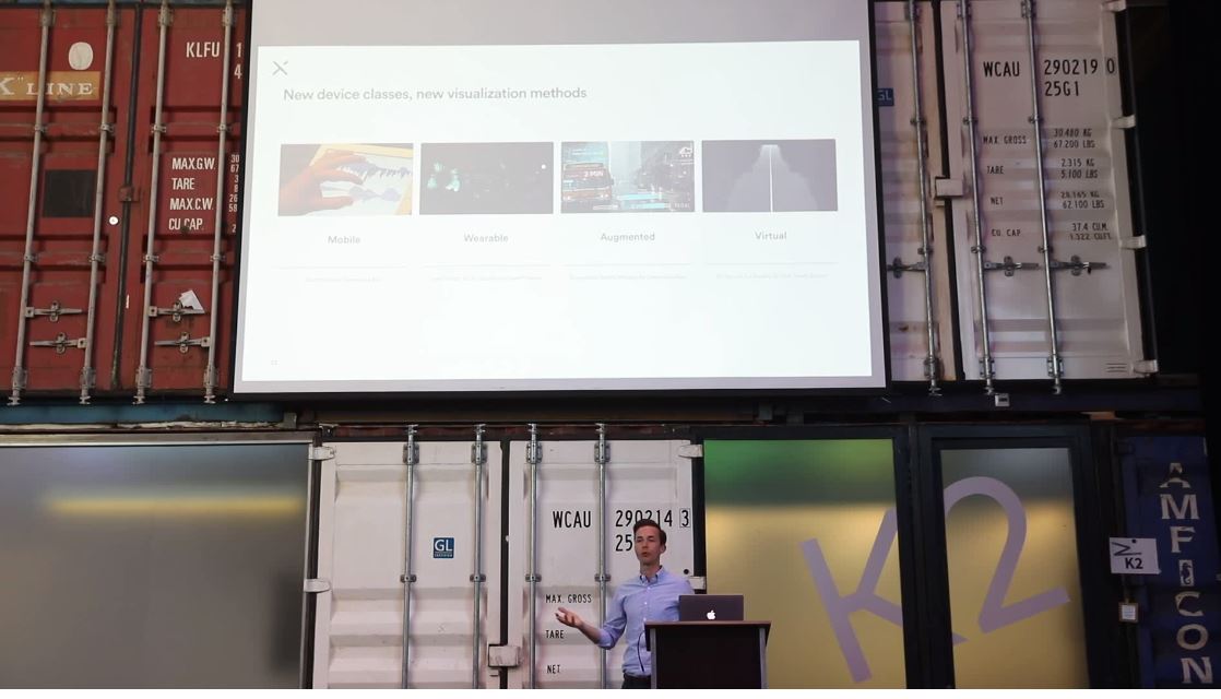
Our aim for this conversation was to show where the world is going and how high-quality, interactive visuals will let people explore the real data behind their interests.
We called this talk an “Infographics Interlude” because businesses often use a context-specific infographic framework to guide readers in a story.
In contrast…
Data visualizations are general purpose, context-free, usually automatically generated – and increasingly designed so that users can explore the data themselves.
Journalists now often use interactive data visuals for editorial illustration. We envision application for consistently communicating a strategy over time – in a way that employees can explore and build perspectives for themselves.
About the artist
Benjamin Wiederkehr studied interactive design at Zurich University of the Arts and now leads the Interactive Things team of designers and engineers. The company builds engaging and meaningful interactions with client audiences. They specifically create websites, apps, platforms, and publications with a digital-first, data-driven mindset.
Some favorite examples
- From the Forum discussion of an in-depth data visualization on an important global topic, World Health Organization violence study
- Honoring the evolution of the 50 most popular song covers of all time: Galaxay of Covers
- The Star, showing athletic prowess – although Benjamin says it’s a simple interaction – you can scroll down to the blue section, then over the Olympic Gold Medal-winning snowboarder Iouri Podladtchikov’s Yolo Flip. From the Neue Zuericher Zeitungen (EN)